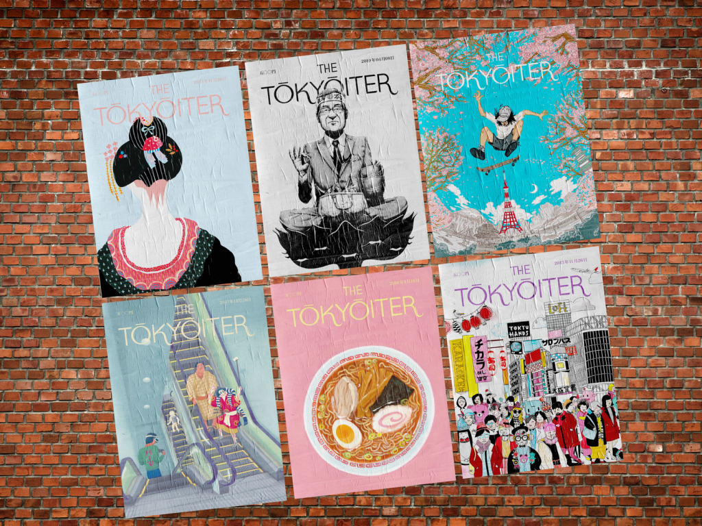
Inspired by the cover artwork of The New Yorker, a group of talented illustrators pay homage to the Tokyo experience by creating covers for a hypothetical mag called The Tōkyōiter. We chat with one of the founders to learn more about the online art project.
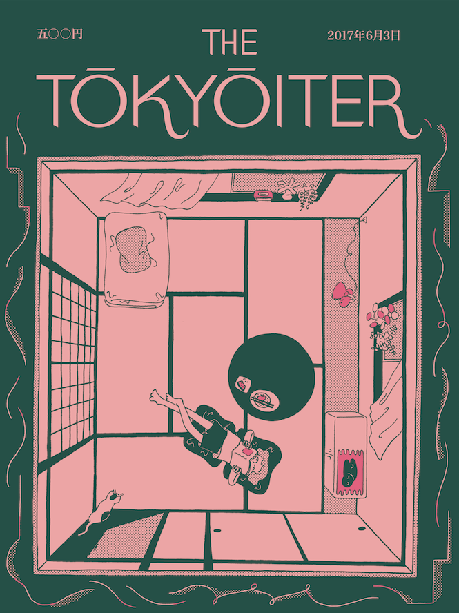
Illustration by Ootsu Moeno
When publisher Harold Ross became frustrated with the stodgy illustrations submitted for the inaugural cover of The New Yorker, he asked art director Rea Irvin to create an image that would set the tone for the new, contemporary magazine devoted to sophistication and wit. Irvin drew the highfalutin dandy with the high collar and snooty nose that graced the front page of the February 21, 1925 issue, which became the model for covers thereafter.
As a homage to The New Yorker’s illustrious covers as well as to Tokyo, the city they now call home, illustrators David Robert and Andrew Joyce collaborated in 2015 to launch the online project The Tōkyōiter. Inspired in part by The Parisianer, which started a few years earlier, the duo enticed a wide range of professional illustrators to create more than 40 faux magazine covers that provide profound insight into Tokyo life.
“A good cover for me is a cover that has some sort of intimate relation to Tokyo, but speaks to everyone,” says Robert, “and adds to the Tokyo they fantasize about.”
Joyce, who has illustrated for the likes of Isetan and Esquire, met with TW at a Kamiigusa coffee shop – whose windowfront is adorned with a summer scene created by the UK-born illustrator himself – to talk about The Tōkyōiter.
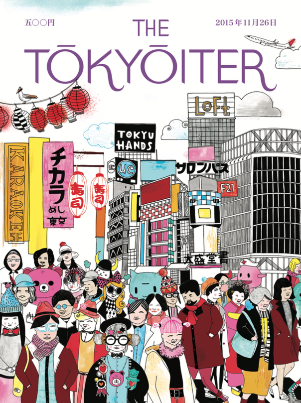
Illustration by Tilly
How was The Tōkyōiter born?
David came to me with this Tōkyōiter idea. I was already running a website-blog where I was asking artists to send an image of Tokyo. David asked me if I wanted to collaborate. It was as simple as that. There is obviously a close community of illustrators. We all know each other, and we know each other’s work. We just started to ask our friends. It’s always risky asking illustrators to do free work. We are not making any money off this. We don’t have a budget, but we obviously have creative and really talented friends that we could ask to get involved. We launched the site with four or five covers, and after the first six months we had 10 or 12.
How much influence came from The New Yorker and The Parisianer?
Obviously the format and style comes from The New Yorker. Even the size of the cover is the standard New Yorker size. Their covers always reflect the life of the city. The Parisianer has been doing that as well. Tokyo should have their own version of this. New York, Paris, Tokyo – it’s a natural fit for this type of project.
Are you at the point where illustrators are approaching you?
We had an exhibition in summer of 2016 in Akasaka and that was our big first event. That exhibition gave us a bit of exposure on Line and social media and different blogs and websites. We started to get e-mails. Before that it was mostly us e-mailing people out of the blue, telling them we love their work, this is our project, would you be interested?
When you reach out to artists, what are you looking for?
We don’t have any brief or any strong direction – or deadline. We only require that they live in Japan or have visited Japan for an extended period. I think it’s important that the cover come from someone’s experience in Japan rather than someone’s view of Japan from the outside.
Why is that important to you?
My image of Japan before I came here is very different from what it is like now. I was obsessed with vending machines when I came here. I wanted to draw vending machines and find new things. We are interested in finding out what are those quirky things people like about Japan. It’s not just sushi and robots. In terms of what we are looking for, we are looking for, one, a high quality of work. There is obviously a high quality of standard and we try to keep it at a good level. And two, I guess, something about an artist’s style that stands out. We’ve got paper collage, we’ve got ballpoint pen, we’ve got paints, we’ve got animation. Something new that, okay, that would really stand out in this collection.
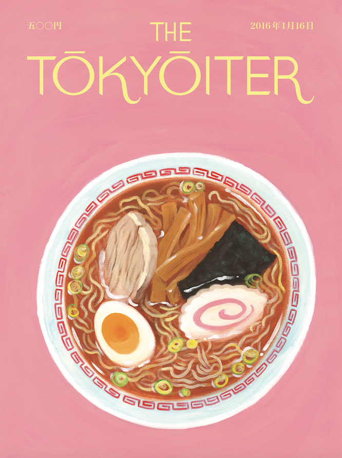
Illustration by Keiko Shindo
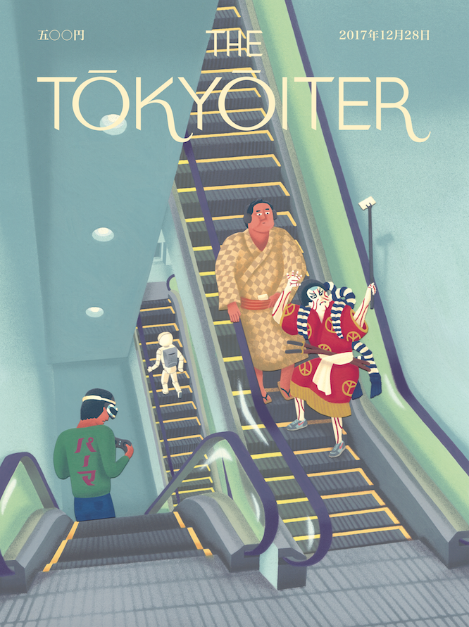
Illustration by Yo Ueda
Are there any artists that you are proud to have lured in?
To be honest, we are really pleasantly surprised with every cover we get. That’s been an unexpected bonus of the project, learning how many great artists there are out there. There is a Russian artist called Waneella who does these pixelated cityscapes. She is very popular on social media, so we thought maybe she is busy, but she was super enthusiastic from the start and really helped us get some exposure as well.
Is there a noticeable difference when comparing Japanese and non-Japanese illustrators?
I thought I would say yes before this project, but actually I don’t think so. Perhaps some of the references of the Japanese artists are more specific. They have a certain type of ramen, or if there is a person on the cover, it is a certain person from Japanese history.
What have been some memorable covers?
There’s an illustrator Andrew Browne and he draws everything with ballpoint pen – the standard pen you can buy at the store. Super-detailed, super-intricate, black and white. It is a very striking image. Miwa Goto is a Japanese artist living in Paris. She makes everything with jeans and cut-up denim. It just looks like an old Japanese drawing from a couple hundred years ago. I like covers like these that have a little secret behind them.
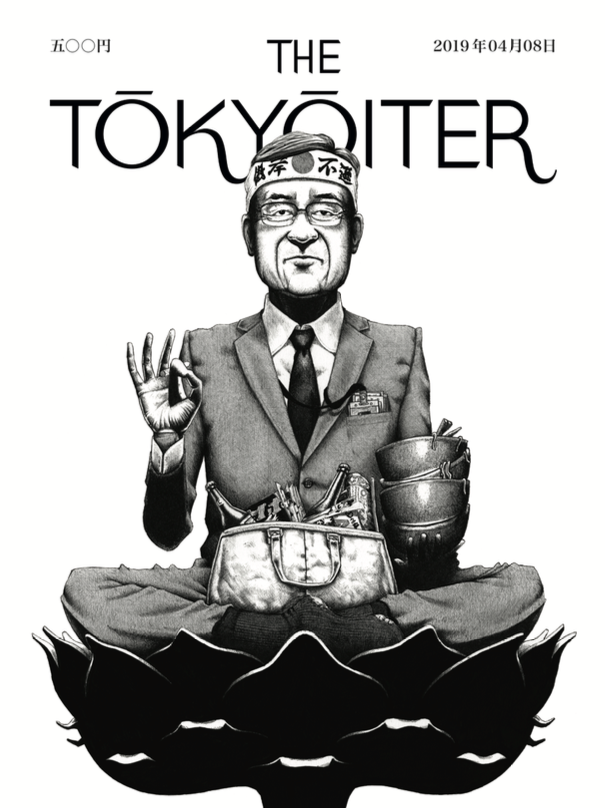
Illustration by Andrew Browne
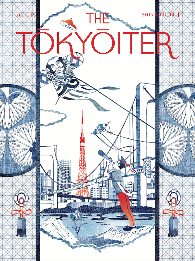
Illustration by Miwa Goto
Have you had to turn down submissions?
We have, which feels strange. I am usually on the other end. Mostly because the person hasn’t been to Japan or perhaps it’s a different medium – photography. We try to keep it illustration or animation.
Where is your boundary when it comes to animation and the use of technology?
The New Yorker has set a precedent. They have (augmented reality) covers. I think they have (virtual reality) covers. I would like to have an exhibition of covers where you hold up your phone and they start to animate with AR technology. To me that is exciting to see where it goes.
You tend to stay away from manga. Is that on purpose?
We definitely went in with the idea that we wouldn’t say no to anything. Manga, I’m no expert in that field, but it does feel slightly separate from illustration. It is maybe an obvious choice to have manga on a cover about Japan and Tokyo, but it just depends. If the right artist contacted us and we love the style and it’s something different, then yeah.
It seems a lot of the illustrations are more influenced by ukiyo-e.
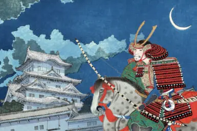
I think if you are an artist or an illustrator living here, and you like print, you like making things by hand, then that kind of style is going to come out. It is nice to see a blending of that old style and new illustration techniques to make something new. It’s nice. I’m a fan of it.
Are there any illustrators you would love to have design a Tōkyōiter cover?
I would love to see the older artists from history create something, like Picasso creating a Tōkyōiter or a Léger. To see an old master create something, that would be the best. To answer your question, we have a big long list, and nobody is at the top or at the bottom, but we definitely have a big pool of illustrators we hope we can get on board.
Learn more at thetokyoiter.com
